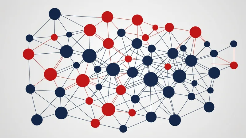
A postmortem without a dependency graph is a postmortem that identifies symptoms. With a dependency graph, you can trace the propagation path from the originating change to every affected service — and answer the question most postmortems struggle with: why did service C fail when we only changed service A?
The dependency graph as a forensic tool
During an incident, the dependency graph serves a different purpose than in pre-merge analysis. Pre-merge, you use it to predict blast radius. Post-incident, you use it to trace the actual propagation path.
The graph gives you the structural explanation for a cascade. If order-api failed and notify-worker also degraded, the graph shows you whether there is a dependency edge between them — and whether that edge was direct or transitive. If there is an edge, the failure is consistent with cascade propagation. If there is no edge, something outside the graph caused the correlated failure, which points to a different investigation path (shared infrastructure, network partition, shared database).
This narrows the hypothesis space in the first 15 minutes of an incident — before you have time to read every log line.
Tracing the originating change
The most common postmortem question is: which deployment caused this? In a system with multiple teams deploying continuously, the temporal correlation between a deployment and an incident is often unclear.
With Buildpathio, you can query the risk score history for any service: every PR that touched a service, with its score and blast radius, in reverse chronological order. After an incident, you query the affected services and look for recent HIGH-risk merges that did not receive an override. Those are your candidates.
This is the API call: GET /score/{service}?since=2026-05-01T00:00:00Z&level=HIGH. It returns all HIGH-risk scored PRs for that service in the time window. Cross-reference with your deployment log to find the match.
"The graph does not tell you what the bug was. It tells you why the bug propagated — which is usually the harder question to answer at 3 AM."
Identifying the missed signal in the pre-merge window
The most valuable part of dependency analysis in a postmortem is not explaining what happened — it is determining whether the pre-merge risk score should have blocked this.
If the originating PR had a HIGH score and was merged anyway without an override, the process failed (the gate should have been in place). If it had a LOW score but still caused a cascade, the graph accuracy failed (a dependency edge was missing). Both are actionable findings with different remediation paths.
A pattern of LOW-score merges preceding cascades usually means the graph is missing runtime-only edges — services that communicate dynamically or through message queues rather than synchronous HTTP. The fix is enabling service mesh telemetry ingestion, which adds those edges from actual traffic patterns.
Converting postmortem findings into graph improvements
Every postmortem where the dependency graph missed an edge is a data point for graph accuracy improvement. There are three common patterns:
- Missing edge: Two services communicate but no edge exists in the graph. Cause is usually dynamic endpoint resolution or event-bus coupling. Fix: enable service mesh telemetry, or add explicit
graph.include_servicesentries in the affected service'sbuildpath.yaml. - Edge present but weight underestimated: The edge exists but the blast radius weight was low because call frequency was not counted. Fix: enable runtime traces with
graph.include_runtime_traces: trueto include call frequency as edge weight. - Correct graph, incorrect threshold: The score was MEDIUM (not HIGH) so merge was not blocked, but the change still caused an incident. Fix: lower the
block_mergethreshold, or add the specific upstream service to analways_reviewlist.
Each postmortem finding that results in a graph configuration change makes the pre-merge risk model more accurate for the next cycle. This is the feedback loop that turns incident investigation into incident prevention.
Structuring the graph section in a postmortem
Adding dependency graph analysis to your postmortem template makes the findings actionable and consistent across incidents. The postmortem section for dependency analysis should answer five questions:
- What was the originating change? Which service, which PR, which merge time.
- What was the pre-merge risk score? Was it LOW, MEDIUM, or HIGH? Was it overridden or gated?
- What was the predicted blast radius? Which services were in the impact set at merge time?
- What was the actual blast radius? Which services actually degraded during the incident?
- Did the graph accurately predict the propagation? Were the actually-affected services in the predicted blast radius? Or were there affected services that weren't in the graph's impact set?
Questions 4 and 5 are the ones that matter most for graph improvement. If the actual blast radius was a strict subset of the predicted blast radius — some of the predicted services didn't actually degrade — that's fine; blast radius is a conservative estimate. If the actual blast radius included services that weren't in the predicted set, that's a graph gap that needs investigation.
Reconstructing the cascade path
After a cascade incident, reconstructing the exact propagation path through the dependency graph is useful for both the immediate postmortem and longer-term architectural work. The reconstruction process:
Start with the service that first exhibited degraded behavior. Look at the graph's incoming edges for that service — which services call it? Of those, which were also degraded? The subset of degraded callers are the next layer of the cascade. Follow incoming edges from each of them, filtering for degraded services, until you reach a service with no degraded callers. That service is the cascade origin.
In a graph of 40 services, this traversal takes 5–10 minutes with a live graph query. Without a graph, it takes as long as it takes to manually trace call paths through logs across multiple services — often 45–90 minutes of the incident's first response window, which is time not spent on recovery actions.
Consider a scenario: an early-stage platform team had a cascade incident that took 2 hours and 47 minutes to fully resolve, with the root cause identified 1 hour and 55 minutes into the incident. After implementing dependency graph analysis, their next comparable cascade was resolved in 48 minutes, with root cause identified in 12 minutes. The difference was not superior engineering judgment — it was having the graph available to bound the hypothesis space immediately.
Designing recurrence prevention from graph findings
The most durable outcome of a graph-informed postmortem is not a process change but an architectural recommendation. If the graph reveals that one service has an inbound edge count of 15 — meaning 15 other services call it and any degradation in it cascades to all 15 — that concentration is an architectural risk that persists across all future changes. The postmortem's action item should include an architectural review of whether that concentration is necessary or whether some of those dependencies can be decoupled.
We're not saying decoupling is always the right answer — sometimes a high-fan-in service is high-fan-in because it genuinely needs to be. We're saying the graph makes the concentration visible, and a visible concentration is a debated risk rather than an invisible one. Teams that act on graph topology findings in postmortems are addressing incidents at the architectural level rather than treating each incident as an isolated event.